Kim & Greg's Kitchen
Kim and Greg’s kitchen before this remodel was the result of an ill-conceived facelift in the early 1980’s. An adjoining addition and multiple layers of flooring resulted in the kitchen cabinetry being “sunk in” to the floor by almost 3 inches! Not only was the result less than aesthetically pleasing but the drop in counter height really strained both of their backs as they used the kitchen. A non-functional dishwasher, out-of-date styling and lack of flow in the space pushed them over the edge to start the remodeling process.
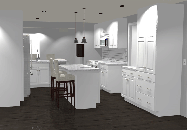
The Planning
As with many older homes, Kim and Greg’s house suffered from too many divisions between spaces, resulting in rooms that were seldom used and a kitchen that made it difficult to interact with family or guests while food was being prepared. They knew they wanted to open up the wall between the kitchen and living room and incorporate some type of central island facing out toward the informal family room. We worked through several design iterations with them utilizing different-sized wall openings and different island and peninsula configurations.
They were able to see each iteration in 2D and 3D models to help them understand how the finished space would look and function. We settled on a configuration that maximized storage, food prep areas and allowed plenty of flex space for daily eating, homework and entertaining guests. The colors and textures chosen are contemporary yet will stand the test of time and appeal to potential future owners.
The Build
Kim had one more surprise in store for us when we showed up on Day 1 to demo their old kitchen. It started with “we were thinking…” and ended with so many painters tape lines on the floor that it looked like a remodeling crime scene. They were interested in the idea of extending the island in their design and turning it 45-degrees to create even more multi-use space. In this new concept, the island could be used for food prep while the kids were doing homework, and it provided space for guests to sit out of the way while dinner was in the works. Because Kim and Greg brought it up early enough in the process, we were able to work with our suppliers to make the necessary changes and additions. The result is awesome!
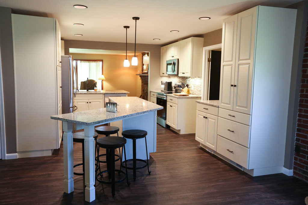
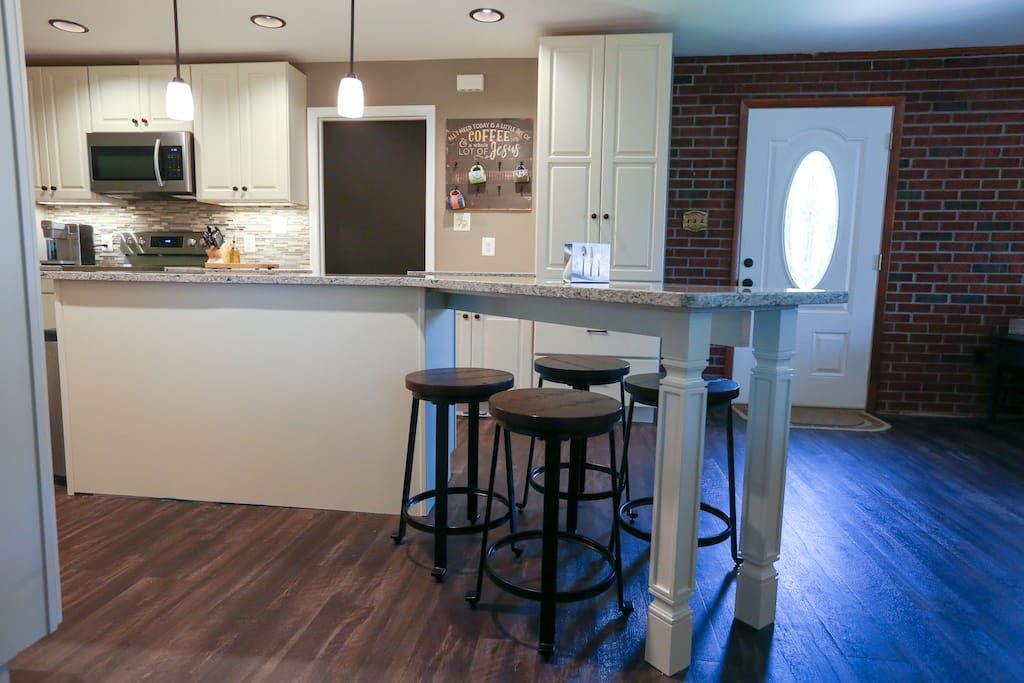
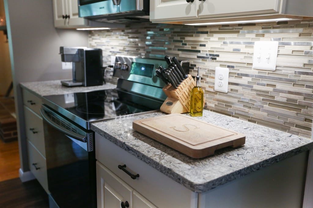
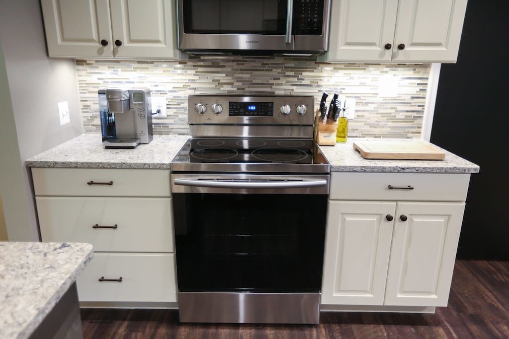
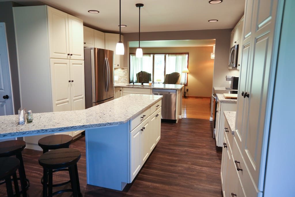
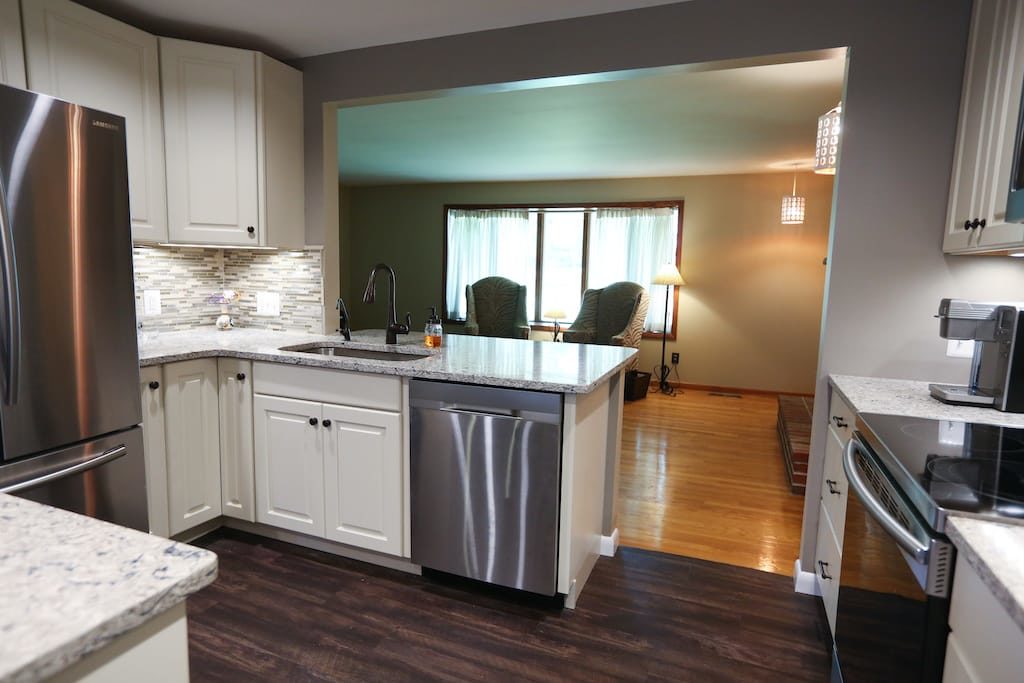
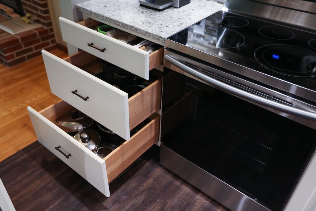
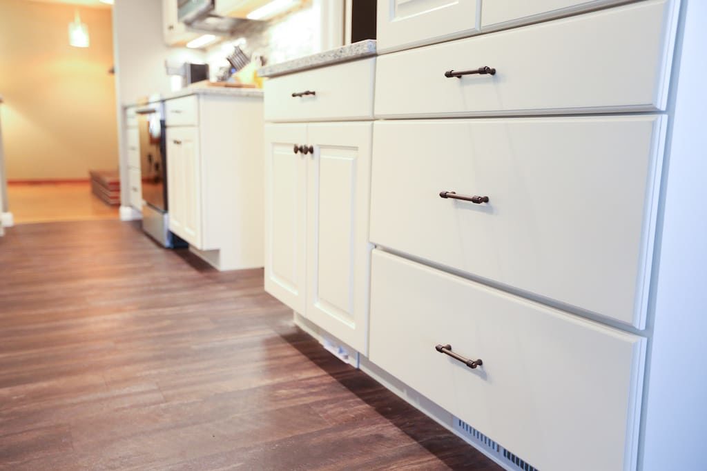
Gallery of the final result
Project Tips
Be an active participant!
Kim and Greg weren’t afraid to ask questions and give feedback. Throughout the design process and during construction, they made several suggestions that resulted in changes that greatly increased the aesthetic and functionality of the space. Asking questions of your contractor and voicing concerns throughout the process ensures that items are addressed before it’s too late and that you will be completely thrilled with the result.
Take (some)
risks
Even if your style is on the conservative side, trust your designer to recommend colors or textures that make a statement in the final product. You’d be surprised how much going outside your comfort zone with small items like the cabinet hardware, sink or backsplash can make a big visual impact and add to the custom feel of your finished space.
Don't forget about functionality
It’s easy to get caught up in the beautiful aspect of a remodel and not put enough thought into what you need from the space to work for you and your family. Write down what works and doesn’t work in your current space. Your designer will help guide you on the options available and what they’ve seen work well in past kitchens. Kim and Greg have a young, growing family and added the extended island with ample seating, double pantry cabinets, family “command center” and open pass-through to the living room.
